Sometimes I have an app idea that would require a LOT of work. Backends, frontends, databases, APIs, complex state-management solutions. Hell, throw some AI in there too. People love when you do that.
Then, I take a step back, think about what part of that I actually want to make and I would actually have fun programming...
TLDR: It's the front-end. It's always the front-end.
So instead of painstakingly making things that I don't care for, and probably won't be a humongous commercial success, I'll do an exploration of what my ideal UI for this idea.
Introducing: Spritzed
Letterboxd for perfumes
Looking around the current market, none of the apps that fit this niche feel particularly premium. The most well-known "database" of perfumes would be Fragrantica, a notoriously ugly website, not even an app.
This is where I come in.
My goal was to make a sleek, refined, premium-feeling app that people could use to track, rate, and discover perfumes with their friends.
I was also hugely curious about how likely my job was to be replaced by AI. So in order to stoke the creative flames, and feel better about myself, I enlisted all the AI front-end generators I knew of: Firebase Studio, Figma Make, and Google's Stitch. Yeah, there's probably more than that but surely these are the best ones.
I gave all these tools the same prompt:
1Create a mobile app that is a database + social media and community relating to Fragrances.
2Ensure the design style conforms to the following:
3
4Clean & premium.
5iOS-flavoured.
6Lots of whitespace.
7Soft minimal gradients.
8Pastel color palette.
9Feedback and particles.
10Thin Icons, prefer icons to images.
11Focus on friends, and collections.
12
13Take profile inspiration from Letterboxd where users can provide their 4 favourite fragrances,
14and it displays all their ratings on their profile.
Here's what each tool gave me
Figma Make
This was actually extremely disappointing. I was hoping that the Figma AI would actually create a figma scaffold, with nested frames and groups, components, auto-layout stuff.
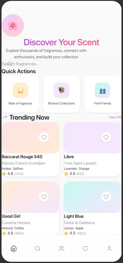
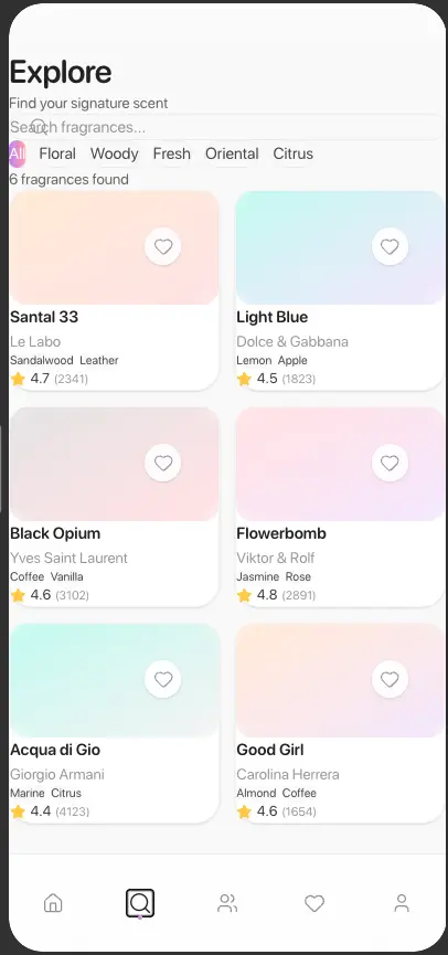
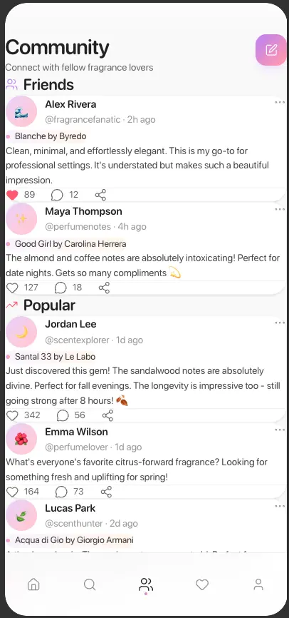
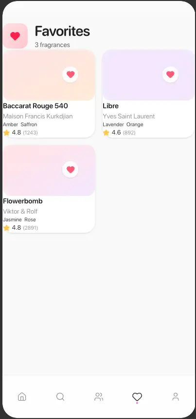
But instead it wanted to create a website in React and TypeScript that was roughly mobile-app shaped. These are the screens it generated. Apologies for the crude screenshots.
| Home Screen | Explore Screen | Community Screen |
|---|---|---|
 |  |  |
| Favourites Screen | Profile Screen |
|---|---|
 | 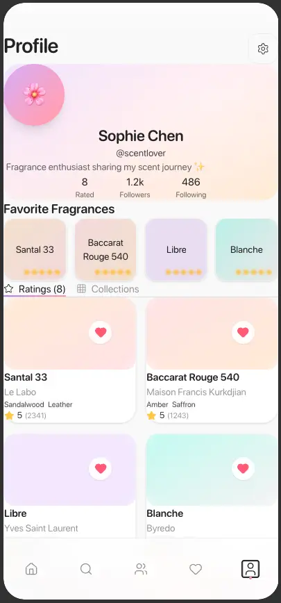 |
So yeah, safe to say my job is NOT in jeopardy from the current state of Figma Make.
Figma really latched onto the part where I said "Soft minimal gradients. Pastel color palette." Took that and just ignored the lots of whitespace part.
These designs are begging for just a shred of padding. Each screen reuses the exact same fragrance component to the point where each of the screens don't look different to one-another. The designs are just all-over the shop.
There was no real inspiration I could lift from these designs. I think the "types" of screens in the nav bar was the only thing I implemented; and even then not completely the same.
Firebase Studio
Maybe it's because my expectations were set so, so low with the Figma AI, I ended up pretty impressed with Firebase Studio. At least in comparison.
However, where I felt that Figma made something so obtuse that no-one could possibly bear to use it, it seemed that Firebase Studio just made Instagram again.
It just appeared too minimalistic. No personality. Could I have prompted some personality in there? Probably, but the whole point of this is to give each tool the same prompts and see what they spit out.
| Home Screen | Discover Screen | Community Screen | Profile Screen |
|---|---|---|---|
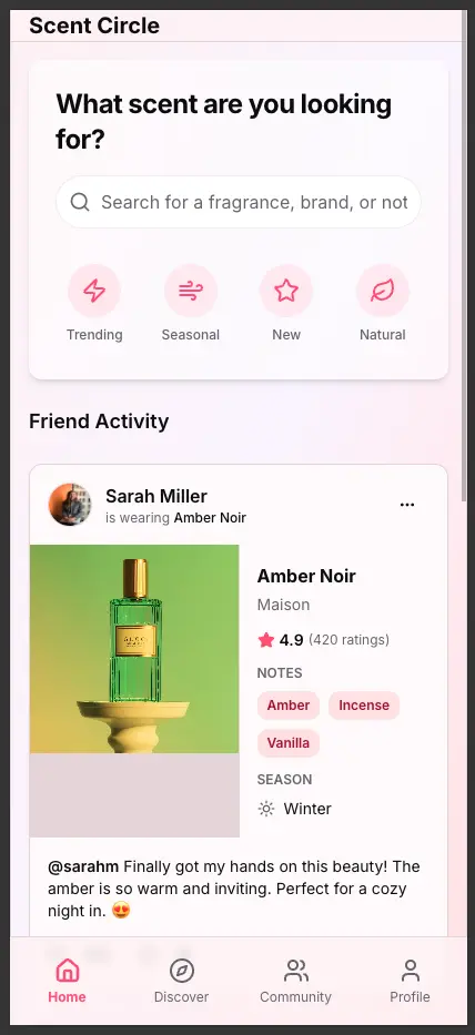 | 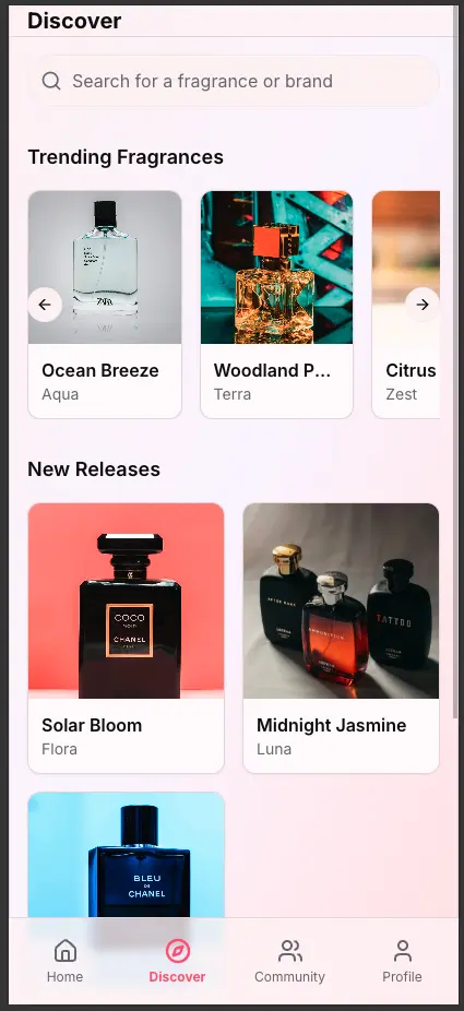 | 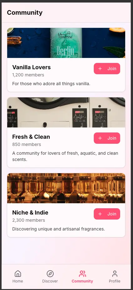 | 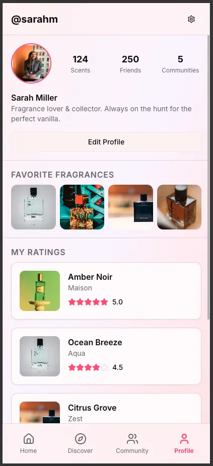 |
Here, there's definitely more stuff that I can work with and take inspiration from. I like the search bar and buttons on the home screen, I like the overall shape of the Discover screen.
The community screen seems a bit undercooked, not really much to it - wouldn't be a useful feature really. At least there are actual images in this one - so I can see what it would look like with some user generated content (UGC).
The Profile screen, and "Friend Activity" section on the home screen feel a little too "Instagram"-y for what I was after, though.
Still leaps and bounds ahead of Figma Make, this one at least looks like an app that someone would use. A boring someone, but that can be fixed.
Stitch (by Google)
Now here's how it's done
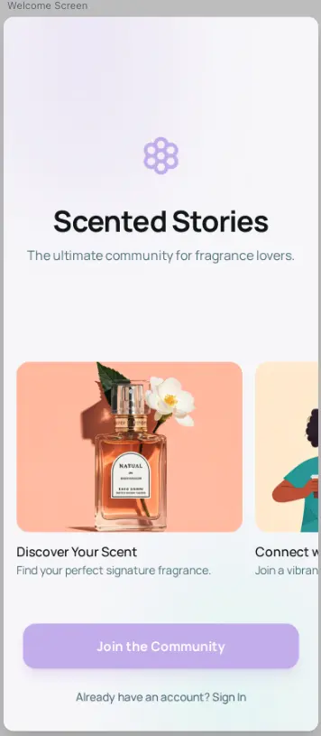
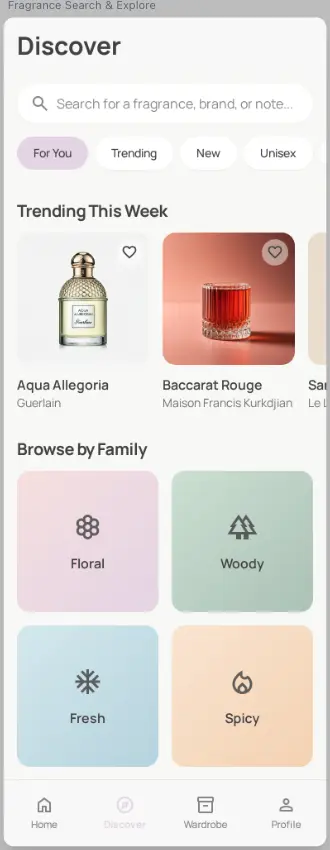
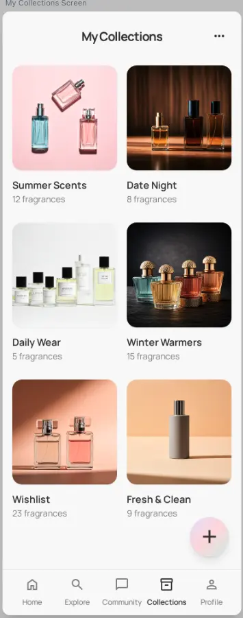
Stitch actually blew me away. I think it's because it didn't try to build a web app with actual code like the other two did. It understood more of the fundamental screens for an app of this style, more than just the ones that would appear on the nav-bar.
It had a cohesive style between its screens, and the style was interesting and visually appealing - a quality that the Firebase Studio UI severely lacked.
It did, however, generate some really tall images (provided you'd be able to scroll in a real app). But it makes my job here a little more difficult, so be patient.
| Welcome Screen | Discover Screen | Collections Screen |
|---|---|---|
 |  |  |
| Feed Screen | Profile Screen | Details Screen |
|---|---|---|
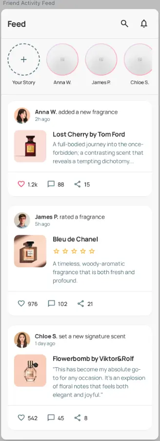 |  |  |
You'll definitely be able to see aspects of this AI-generated design in my final UI.
I'm going to call out specifically the shape of the user posts, the details screen, and roughly the profile & details screens. I think whitespace is broken up nicely with borders and dividers, segmenting content nicely without the whole thing just feeling like a big list.
It did kind of hallucinate the contents of the nav-bar and whether it was visible on certain screens, but I'm happy to leave that as an exercise to the reader. It also implemented a "stories" feature, which is a bit rich coming from a fragrance app with zero users.
I liked the inclusion of a welcome screen, maybe I'll have to do a project about the perfect onboarding flow, but this screen was omitted from my final designs...
I'm sure you're curious about them by now.
LiamDoka-generated
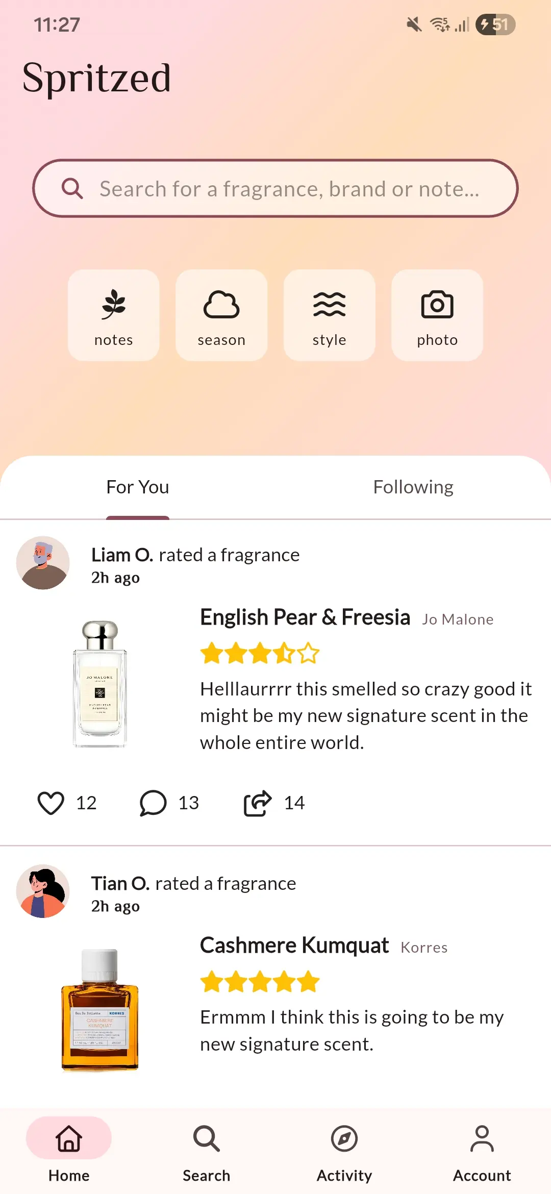
Armed with Flutter 3.38 and dot-shorthands, I whizzed through 5 screens in less time than it took me to write this post.
That's a lie
But I definitely learnt a lot about CustomScrollViews and the concept of slivers and how they're not as scary as they sound.
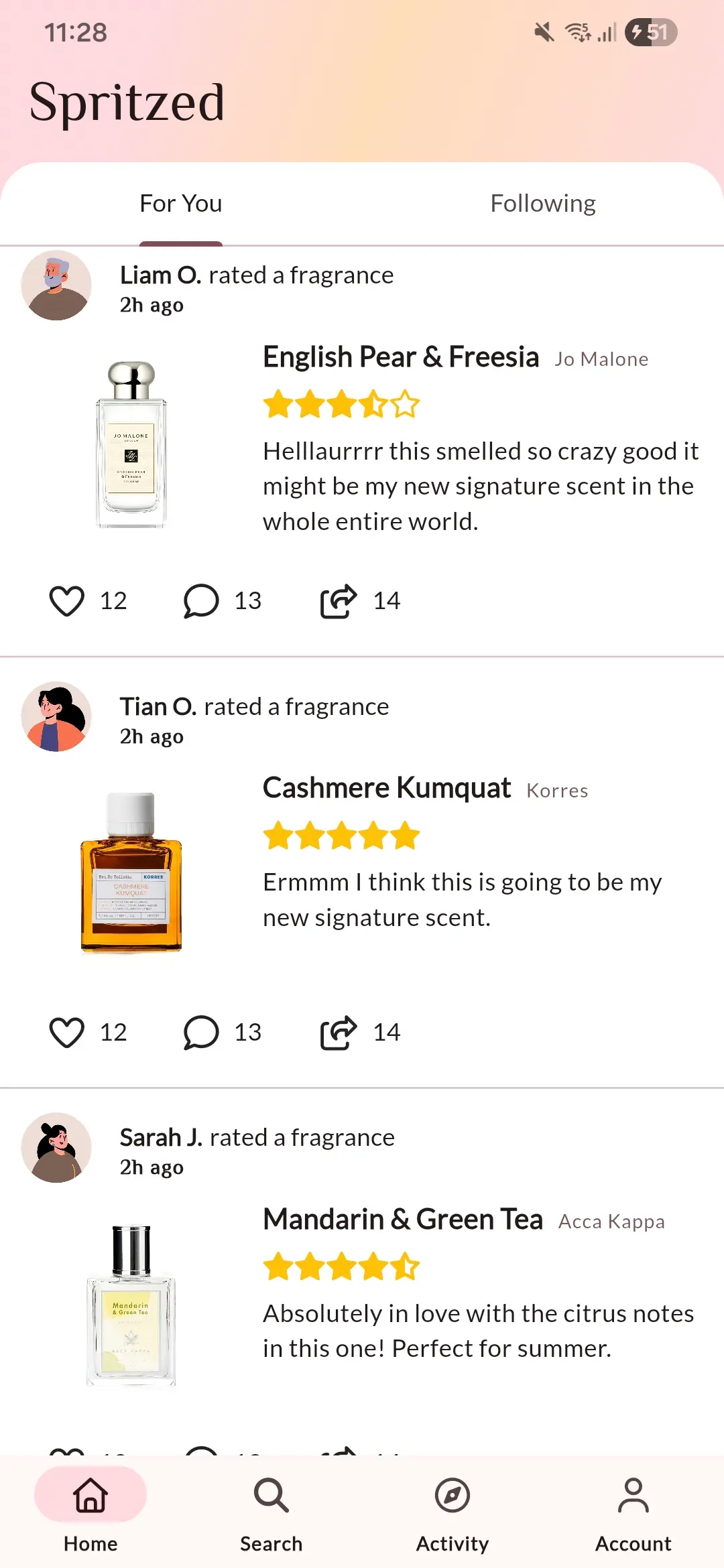
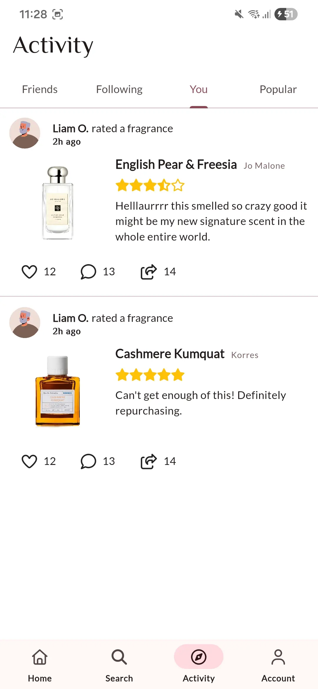
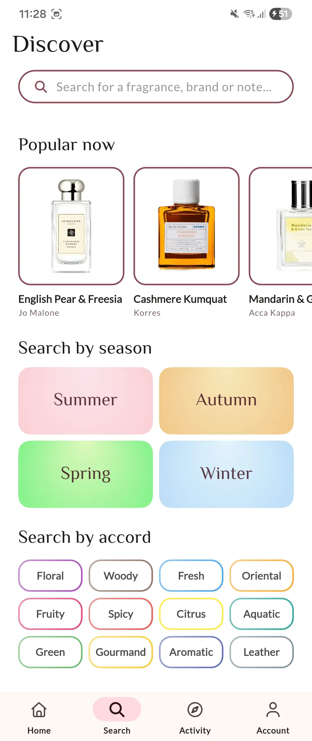
I'm not fully satisfied with the outcome, I especially think the Home Screen, Discover Screen, and parts of the Activity Screen.
Damn that sounds like most of it.
No, well yes. But also I had to cut it off somewhere before I went insane. You can go over the same design reworking it over and over again countless times, and it'll never look "perfect".
The goal of this project was to spin up a prototype UI as quick as possible. So keep that in mind; sorry for all the pre-johns
| Home Screen | Home (Scrolled) | Activity Screen |
|---|---|---|
 |  |  |
| Discover Screen | Profile Screen | Details Screen |
|---|---|---|
 |  |  |
General
As you can see I sort-of gave up on the whole "iOS-flavoured" prompt. I leant heavily on Material Design principles and components. Sometimes it feels impossible not to in Flutter.
Keep my color-palette Material Design flavoured as well, setting up every single color used in the design from the following material ThemeData component/
1final lightThemeData = ThemeData.from(
2  useMaterial3: true,
3  colorScheme: .fromSeed(
4    seedColor: Colors.pink,
5    brightness: .light,
6    dynamicSchemeVariant: .tonalSpot,
7  ),
8);
The only hardcoded colours in my design are those on the Discover screen and also the gold stars, which sets me up nicely to easily pivot to another primary colour - or even colour-system - if the hypothetical, made-up requirements changed.
Only used two fonts:
- •El Messiri for headings - originally an arabic typeface, but it has a beautiful, sleek, and premium-looking latin alphabet too.
- •Lato for all the body text.
I like pairing a serif and sans-serif font, and limiting a design to often a single primary colour. I find it keeps all new components feel cohesive, and the serif font injects a little personality into the design.
Keeping with the sleek feel, I used whatever free, outlined Font Awesome Icons that I could,
Specifics
I set the Home screen up to be a "Search-first" experience,
where the search box and buttons (as can be seen in the Firebase Studio home screen) are the first visual element in the hierarchy.
Using the aforementioned CustomScrollView, this search bar collapses cleanly into the second image of the scrolled state.
I'm not completely sold on the Search Bar component itself, nor its supporting buttons. They don't look as cohesive with the linear gradient background as I would have liked, but I wanted to be able to re-use the exact same component on the Discover screen and that was a trade-off I was willing to make.
Also not fully sold on the "Popular now" section of the Discover Screen. I truthfully just couldn't be bother loading in any more assets into the project. Use your imagination and replace the white backgrounds with something more like the Firebase Studio or Stitch mock-ups.
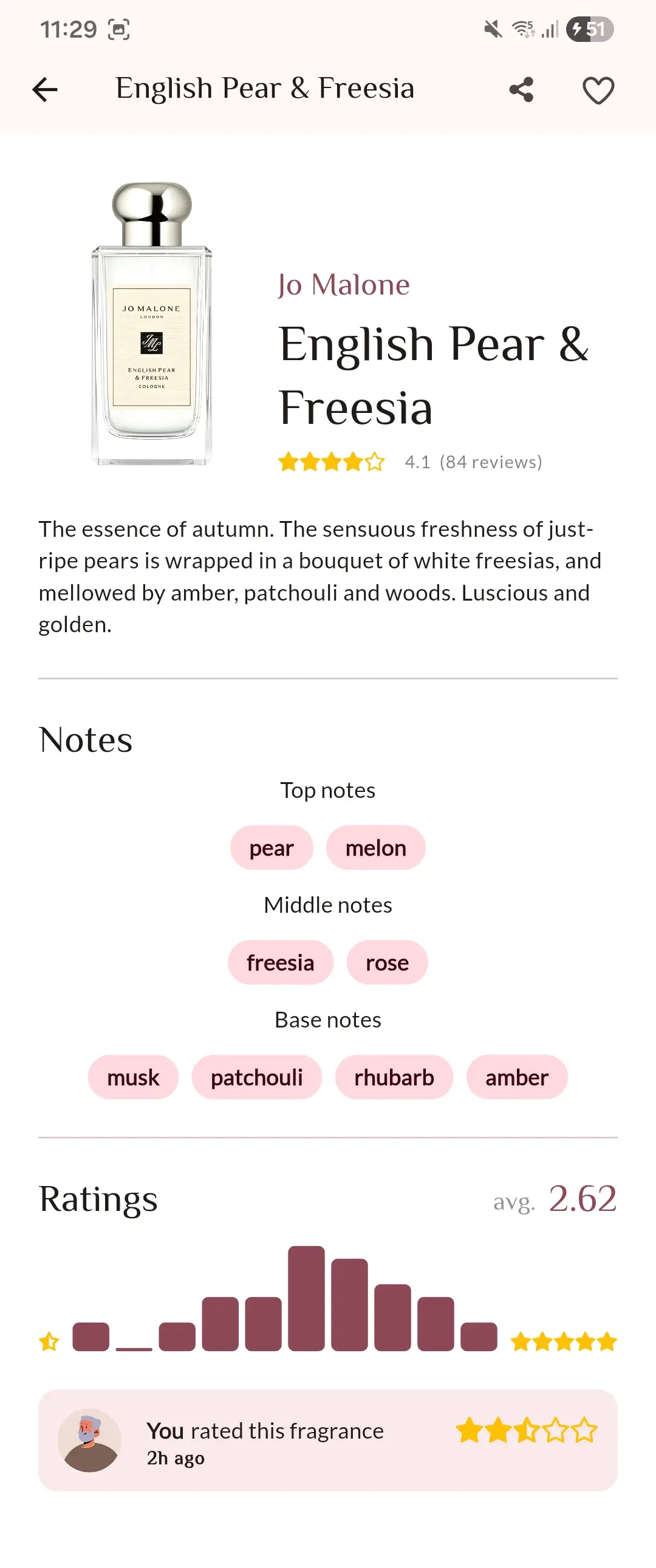
Cutting to the chase, I stole pretty much the exact "Star rating" widget from Letterboxd. They won't mind I'm sure. Also yanked their use of the top tab-bar for displaying slightly different pages in the same screen. Thanks, Letterboxd.
Overall
I'm most happy with how the Profile and Details screens turned out. There's about 100 different features that I could shove into just the mock-up before I even begin to think about the architecture required for an endeavour of this proportion.
AI isn't quite there yet. It "feels" wrong.
For now, my job is safe.